The application graph editor
In the previous steps, an example application graph was generated from YAML. The graph can also be edited interactively and any changes will automatically be written back to the YAML representation.
Using the application graph editor
By default, both left and right panels are maximized when an application is created or opened. Minimize the left one, that contains application controls, to provide more space for the main view. The ratio between main view and right panel can be adjusted by dragging its border. Drag the background to pan the graph view and scroll to zoom in or out.
The mini-view switcher on the bottom left can also be used to switch to the 3D scene representation on the main view. In this case, the graph is still available in the Graph view tab of the right panel. However, users are not allowed to make modifications there, only trigger buttons and check the state.
The mini-view switcher can also be minimized to provide more space.
Editing component settings
Component parameters and settings can be edited directly from the graph view. Click on the component block to open its settings in the Scene tab of the right panel.

Auto-lifecycle events
Because the timer components are lifecycle components, they only count down the time when they are active. By default, the "Load" or "Transition" events start the lifecycle component in an unconfigured state. The "auto-configure" and "auto-activate" toggle buttons on the component block can be used to enable or disable auto-lifecycle events.
When both toggle buttons are enabled, the YAML code will show the corresponding events for the components:
    events:
      transitions:
        on_load:
          lifecycle:
            component: timer
            transition: configure
        on_configure:
          lifecycle:
            component: timer
            transition: activate
Disabling one or both auto-lifecycle event buttons will also remove the corresponding events from the YAML, while enabling the switch will regenerate the event in the YAML.
Setting component parameters
Component parameters can be edited directly in the Settings tab. Change the value of the Timeout parameter and look for the corresponding change in the code editor. Then press Start on the application and observe that the timer now has a different duration before triggering the "Is timed out" predicate.
Adding and deleting elements
Elements can be added to the graph using the right panel; switch to the Add component section of the Scene tab
to see a list of available application elements. At the top of the list are the "Hardware Interface", "Trigger Events
Button", "Sequence" and "Condition" nodes. These are followed by a list of all available components from AICA Core and
any additionally installed packages, grouped by package. Clicking on any element in the sidebar will automatically add
it to the graph.
Graphs with multiple instances of several elements can get quite extensive. The Scene List section provides an overview of the added components. Clicking on an item in the list centers the view on the respective component in the graph, and opens its settings.
- Linux
- macOS
To delete an element from the graph, select it with a click and then click Remove in the available options that appear above it. Elements can also be deleted by selecting them and pressing the Backspace key on your keyboard.
To delete an element from the graph, select it with a click and then click Remove in the available options that appear above it. Elements can also be deleted by selecting them and pressing the Delete key on your keyboard.
For this example, let's add a "Trigger Events Button" to the timer application by clicking on it in the right panel. A new button should appear on the graph and in the code. This is an interactive element that can be used to trigger events through mouse clicks and interact with the flow of the application.
The right panel can be minimized with the icon on its top left.
Drag the button to change its position in the graph. This will also update the corresponding Trigger Events Button position in the Code tab.
Creating and deleting event edges
To create a new edge, move the mouse over an event source handle until the cursor changes to a targeting reticule. Then, click and drag to create a draft edge. Pull it towards a target handle (on the top left of a component) until the cursor changes again and the draft edge snaps in place, at which point you can let go of the mouse button. If the connection is valid, it will create a new event edge with the default event (Load). Event source handles are found under transitions and predicates of a component and look like that:

All components also have a similar source handle icon on the top right. This handle is not an event source and cannot be connected to target components or hardware with event edges. Instead, it is a condition source used to connect condition edges to condition and sequence inputs.
Invalid edge connections will automatically be rejected.
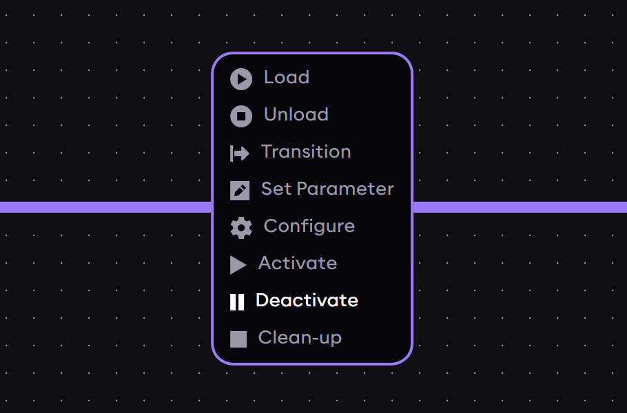
Create an event edge between the new trigger button and the Timer 2 component. The default event type for newly created edge is always "Load". To change the type of event that should be triggered, click on the event label on the edge to open a selection menu showing other available event types (for example, Load, Unload, Configure...) and click on the desired event. This will close the selection menu and update the YAML code accordingly.
For this example, choose the Deactivate event in order to pause the timer on click of the button.
Clicking on an edge also selects it, which is indicated by the increased line thickness. Clicking away from the edge will deselect it. While the edge is selected, press the Backspace (Delete for macOS) key to delete the edge. This will also remove the event from the YAML representation.
Now add a second trigger button, create a new event edge to Timer 2 and choose the Activate event type.
Renaming elements in the graph
Both buttons now still have the default "Trigger Events Button" name, which may become confusing in larger applications. To rename an element in the graph, select it with a click and then click Rename in the available options that appear above it. Give the two buttons a new name: "Pause Timer" for the button with the Deactivate event, and "Play Timer" for the button with the Activate event.
Now, try to run the application again and use the Pause Timer and Play Timer trigger buttons to deactivate and activate Timer 2 while it is active. Verify that once deactivated, the elapsed time does not count towards the component timing out and it only times out once it has been in the active state for a total of 4 seconds. That is, deactivating the component will freeze the timer until reactivation.
Now that we learned to add buttons and create event edges, try to do the same for components. As an exercise, delete all elements from the graph and try to recreate this example from scratch using only the graph editor. Search for and add the timer components from the sidebar, set the auto-lifecycle events, and connect the transition edges. Remember to set a timeout value in the component parameters.